- Home
- The Element of Color in Art
- Analogous Color in Art
Analogous Color in Art
Not sure what analogous color in art is and how to use it?
Here's a lovely example by Georgia O'Keeffe to start us off...
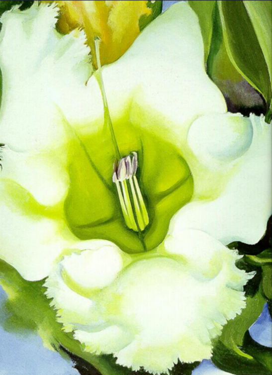 "Cup of Silver Ginger" Georgia O'Keeffe 1939
Analogous color is a useful item to add to your artistic tool-kit - the more ways you've got to express yourself through your art, the better!
So, as a reminder, let's first have quick look at the color wheel...
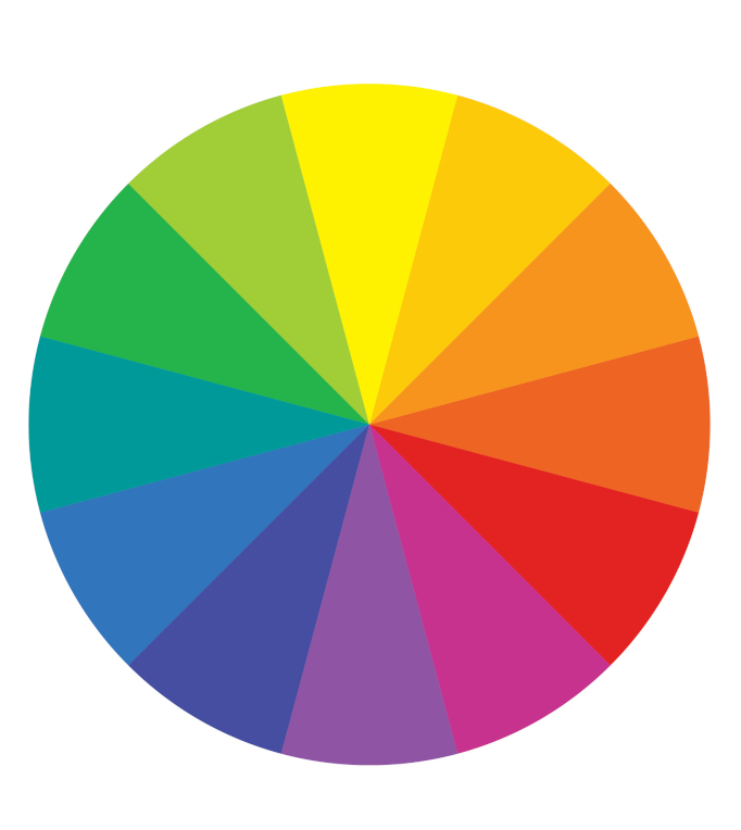 Color Wheel
Pick one of the colors on the wheel and look at the color to each side of it.
Say you picked yellow - we have yellow/green on one side of it and yellow/orange on the other side. So these three colors are analogous.
And that works with any color on the color wheel, although usually the primaries - red, yellow and blue, would be the dominant color in your scheme.
Sounds do-able, right?
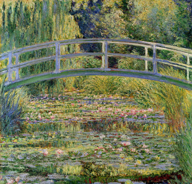 "Japanese Bridge" Claude Monet 1899
Now let's look at Claude Monet's "Japanese Bridge".
The bridge and water lilies are represented in gentle hues of blue and green - the varying shades bringing a sense of harmony and tranquillity to the painting.
"But hold on a minute," I hear you say - "I see pink colors on those water-lilies!"
And you with your sharp eyes are absolutely right!
Now, here's the thing - if a work is painted in totally analogous color it can look monochromatic.
There's nothing wrong with that - it can be pleasing to the eye and be exactly the effect you're after.
However, there might be occasions when you feel your analogous color scheme needs a very light touch of a complementary color to break that monochromatic feel - as we see happens in 'Japanese Bridge'.
(Just a reminder on complementaries - they are red/green, yellow/violet, blue/orange.)
 Beautiful analogous colors of a Birch wood in Autumn.
Let’s think about an autumn day now.
See the warm oranges, golds and reds? Those colors also line up next to each other on the color wheel, and are beautiful examples of analogous colors in action!
The color transitions are gentle and harmonious and may be just the combination that suits your idea or mood.

Quick Tip: When working with analogous color, remember to vary their tonal value (darks and lights). This helps avoid monotony in your painting.
A Touch of Drama?
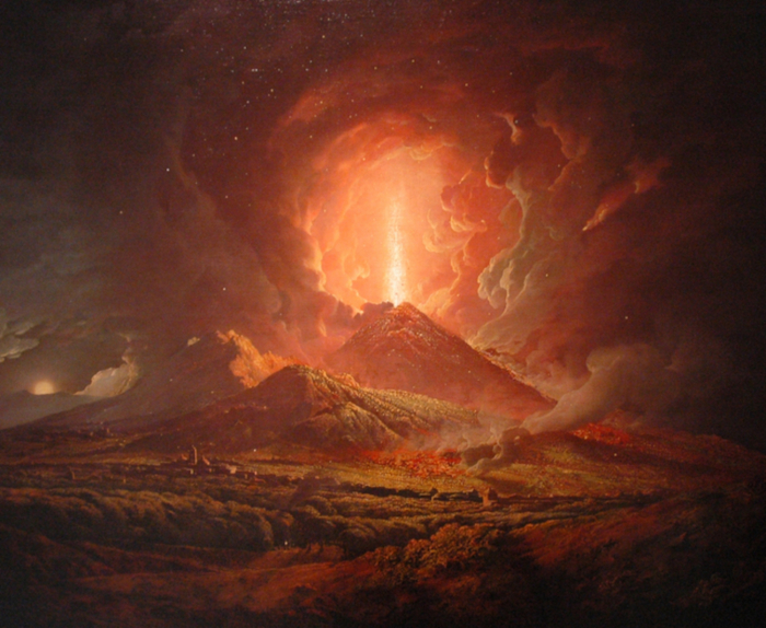 "Vesuvius from Portici" by Joseph Wright c1778
There's nothing monotonous about this painting!
A good example from Joseph Wright of the use of analogous color in art. We can see that they don't always have to portray a gentle mood.
As well as his color choice, the dramatic use of the contrasting very light and dark tones produces the effect he wants.
 Drama in blues and greens.
Blues and greens don't always have to depict a gentle mood either!
Here the drama lies in the swooping and swirling lines of motion and, again, the juxtaposition of very light and dark tonal values.
So, how are you going to bring all this beautiful, harmonious color into your art?
Where to begin?
Start by selecting a dominant color, one that will set the mood for your artwork.
Then, pick the colors on either side of your dominant color on the color wheel.
These will be your analogous colors, eager to do your bidding!
Now, sometimes it happens that when you've added your lights and darks to your work you still think it looks a bit 'samey'.
If so, you can always add a very light touch of a complementary color somewhere in your scheme - that should fix it!
(Well, if it was good enough for Claude Monet...!)
Let Your Art Take Wing!
 Butterfly in Summer Field.
You can't go wrong if we follow the masters. No world-renowned artist was born that way, so it’s all about trying out different colors, making some "happy accidents", learning from great artists' work - and also learning from our own!
If you want to see great art and can't easily visit art galleries or museums, WikiArt is a very good visual art encyclopaedia. I'm using it all the time for inspiration, and if you want to buy prints or even actual copies they do that too.
So there you are, you now know how to use analogous color!
Start small, no need to paint a mural with them quite yet - unless you're aching to get that paint all over your walls!
Just enjoy experimenting and see what different effects you can create with them - they can be a lot of fun to work with!
Are you in a vibrant red mood today?
A joyful yellow mood?
Or something soothing in blue?
Whichever one you pick, immerse yourself in those gorgeous analogous colors, and let your art take wing!
Painting Analogous Colors - Ideas and Inspiration
Back to the Element of Color in Art
Like this page? Click the icons to share it.