- Home
- The Element of Color in Art
- Complementary Colors in Art
Complementary Colors in Art
Using complementary colors in art might be just the magic ingredient you need to get those creative juices flowing again.
They can add lift and energy to your work and banish that 'stuck in a rut' feeling!
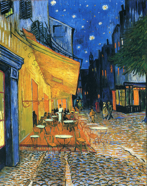 "Cafe Terrace at Night", Vincent Van Gogh 1888
You're probably familiar with Van Gogh's "Cafe Terrace at Night" and perhaps you've wondered why it looks so vibrant?
That's the enchantment of complementary colors at play. The blue night in the painting contrasts spectacularly with the warm yellows and oranges of the café, making the scene pop!
Van Gogh said, "There is no blue without yellow and without orange." and we can see how much he loved that combination in his paintings of golden cornfields and blue skies.
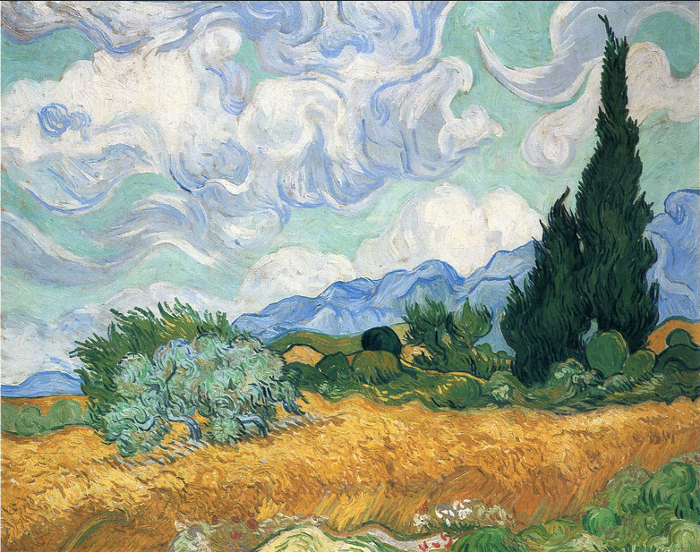 "Wheatfield with Cypress Tree", Vincent van Gogh 1889
So, what exactly are complementary colors? Quite simply, they're the ones that sit directly opposite each other on the color wheel.
Think
red and green, blue and orange, or yellow and violet. They're called
'complementary' because when used together, they enhance each other.
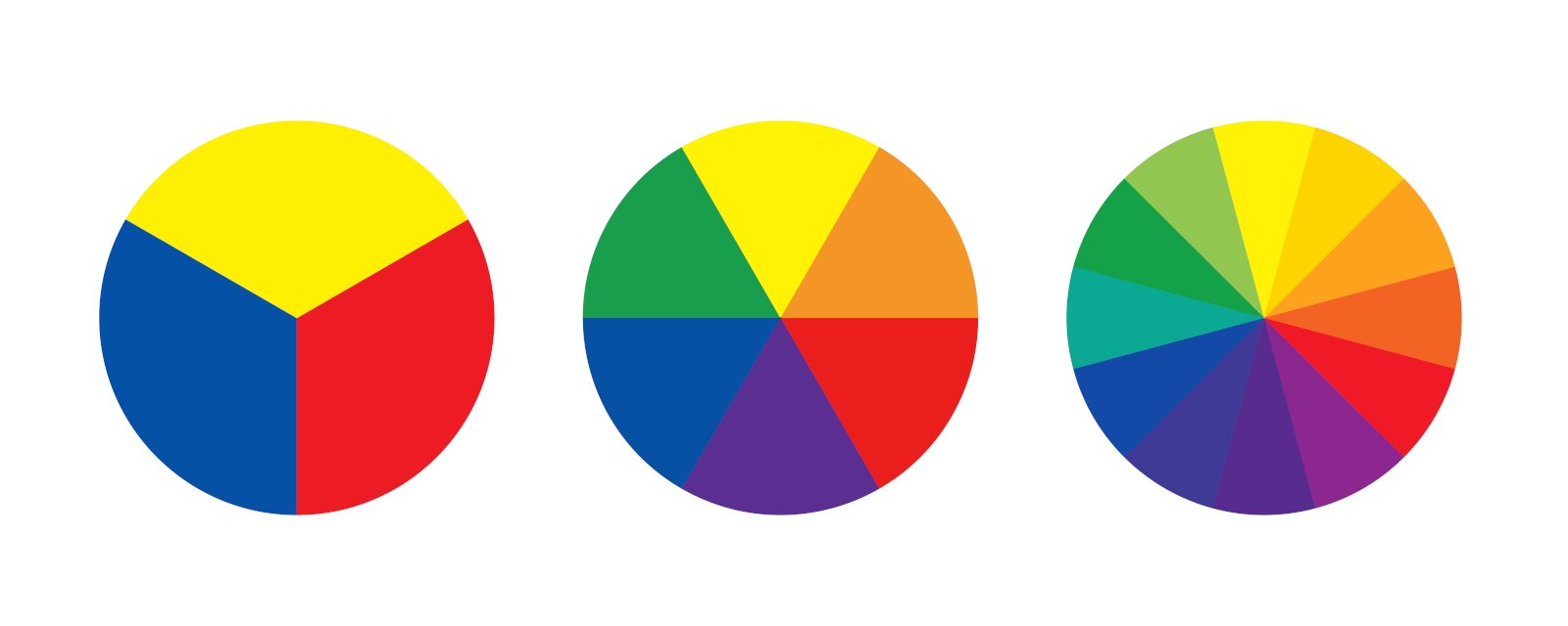 Color Wheel showing complementary colors. (Adobe stock images)
Here's where they are on the color wheel:
On the left we have the basic primary colors, red, yellow and blue. We can't make these by mixing any other colors together.
Next along the row we see what happens if we mix two of those primaries together. Each primary color now has another color opposite to it on the wheel - that's its complementary.
So the three pairs of complementary colors in art are red and yellow making orange; yellow and blue making green; blue and red making violet.
The last wheel shows what happens when we start mixing those six together and so on.
Now, let's see if we can pick up some more tips from the masters!
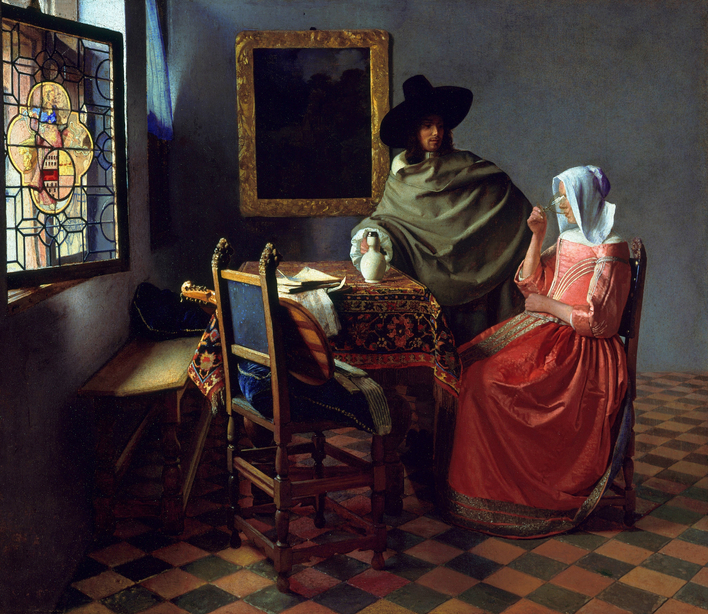 "The Glass of Wine" Johannes Vermeer c1658 - c1660.
We're travelling further back in time to the 17th Century when Johannes Vermeer painted "The Glass of Wine".
Obviously the main focus of his painting is on the man and woman - his use of red and green complementary colors is one of the reasons why our eye is drawn to them.
Because there's no way we're going to miss the red of that skirt, is there? Especially as it's emphasised and heightened by the man's green cloak!
Even the floor tiles echo the red and green combination in a muted way.
Now, the whole composition might feel unbalanced with most of our focus being on the couple, but don't you love the way there are bits of red on the table-cloth leading our eye across the painting?
And then, how about the neck of the musical instrument pointing us to the window, where that tiny piece of red glass does the final trick - balancing the whole painting so beautifully?
What a master!
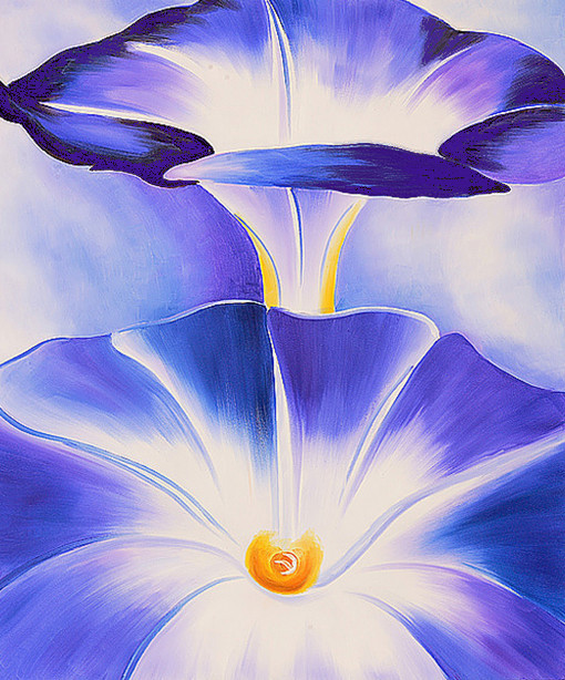 "Blue Morning Glories" Georgia O'Keeffe 1935
Next stop on our time travel journey and we've whizzed back up to the 20th century with "Blue Morning Glories", another of Georgia O'Keeffe's large close-up paintings
We can see that hardly any yellow/orange is needed to stand out brilliantly against the large area of violet and blue.
If you cover up the yellow/orange part with your finger much of the painting loses it's impact.
A great illustration of how complementary colors in art can bring your work alive!
Fancy having a go?
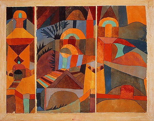 "Temple Gardens" Paul Klee 1920
As we know, art doesn't always have to be representational but if we're looking at complementary colors in art, this one by Paul Klee shows his very light touch with them.
Scrumptious color - it looks like somewhere hot to me! Those touches of cool blues and greens amongst the reds and oranges emphasise the heat, don't you think?
It's also an example of what was going on in art at about the same time that the pure abstract explosion was taking off.

Quick Tip: If one of your colors is too bright and needs damping down a touch, just mix it with a little of it's complementary. Works a treat!
Your turn next!
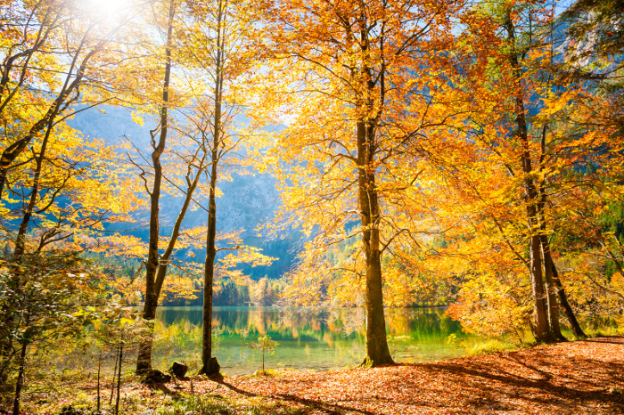 Beautiful Autumn trees by a lake. How they glow with that blue hill behind them!
So what about your own artwork? How can you use those colors to bring a fresh vim to your work? It's not always about using them in abundance, but rather about how they relate to each other.
Imagine you're painting a quiet lake surrounded by a glorious autumn landscape. You might paint the entire scene mainly in warm hues – reds, oranges, and yellows.
But if you add some unexpected blue or mauve shadows or some glimpses of sky, suddenly, the painting comes alive!
Being complementaries, that blue distance shows off the orange trees beautifully, creating a dynamic visual effect. What marvellous color!
 White tulips on a green background.
Or maybe you're painting a vase of fresh white tulips? You could paint a rich green background and that would be nice.
But perhaps you're in the mood for something with a bit of zing? Try adding one red tulip amongst the green - that should do it!
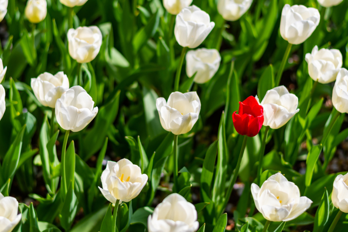 A red complementary doing its thing amongst the green and white!
It's important not to overdo it. Approach colors that are complementary with a delicate touch. They can be loud, they can be very loud! (But hey, if that's how you like it, I'd hate to rein you in!)
Just bear in mind that using them too much might make your artwork overwhelming, but it's all about finding out what works for you and what you want to convey.
(Good to know - if you have equal size
and equally bright areas of the complementaries, they tend to fight each
other. Your audience won't know where the focus of the work is
supposed to be.)
Grab that Sketchbook - you're off!
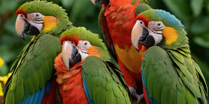 "Complementary colors? We love 'em!"
Okay, so which dynamic duo do you fancy starting with? Does the red/green combination speak to you most? The blue/orange? Or will it be yellow and violet?
Why don't you just splash those colors around in your sketchbook - a page for each, and see which one grabs you most today?
Then maybe start with an abstract to loosen you up. Or are flowers your thing? Still life? Landscape?
Experiment with colors that are complementary, play around, and see how they can transform the mood and energy of your paintings.
No two artists will view colors the same way. It's subjective and personal. So look on these colors as another tool you can add to your artist's kit.
Your real power lies in your personal perspective and emotional intuition.
If you've been feeling stuck lately, then trying out something new or just messing around a bit with complementaries can open up new horizons for you.
Look on them as invitations to explore and create!
Have fun!
Painting with Complementary Colors - Ideas and Inspiration
Like this page? Click the icons to share it.